Manufacturing and Industrial
LELCO
Our Services
- Brand Audit
- Brand Implementation
LELCO: Lighting the Way Forward
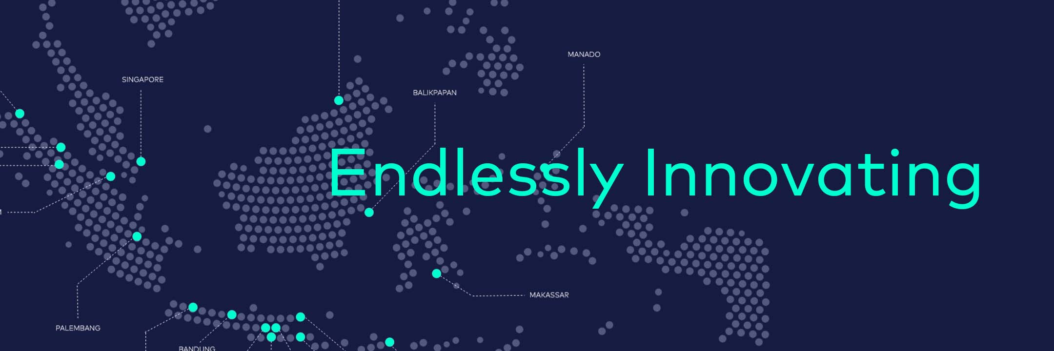
With roots going back to 1980, LELCO has been a pioneer in Indonesia’s lighting and electrical industry. Known for its advanced manufacturing capabilities and high-performance products, LELCO has spent over 40 years helping illuminate homes, cities, and industries across the country.
But after decades of growth, it was time to refresh the brand’s image—one that could shine just as brightly as the innovations behind it.
CHALLENGE
A Legacy Brand Ready to Evolve
LELCO had the scale, credibility, and product range—but its visual identity didn’t reflect how far the company had come. The challenge was to revamp the brand without losing the trust built over decades, while aligning it with a new global vision.
APPROACH
Design That Reflects a Brighter Vision
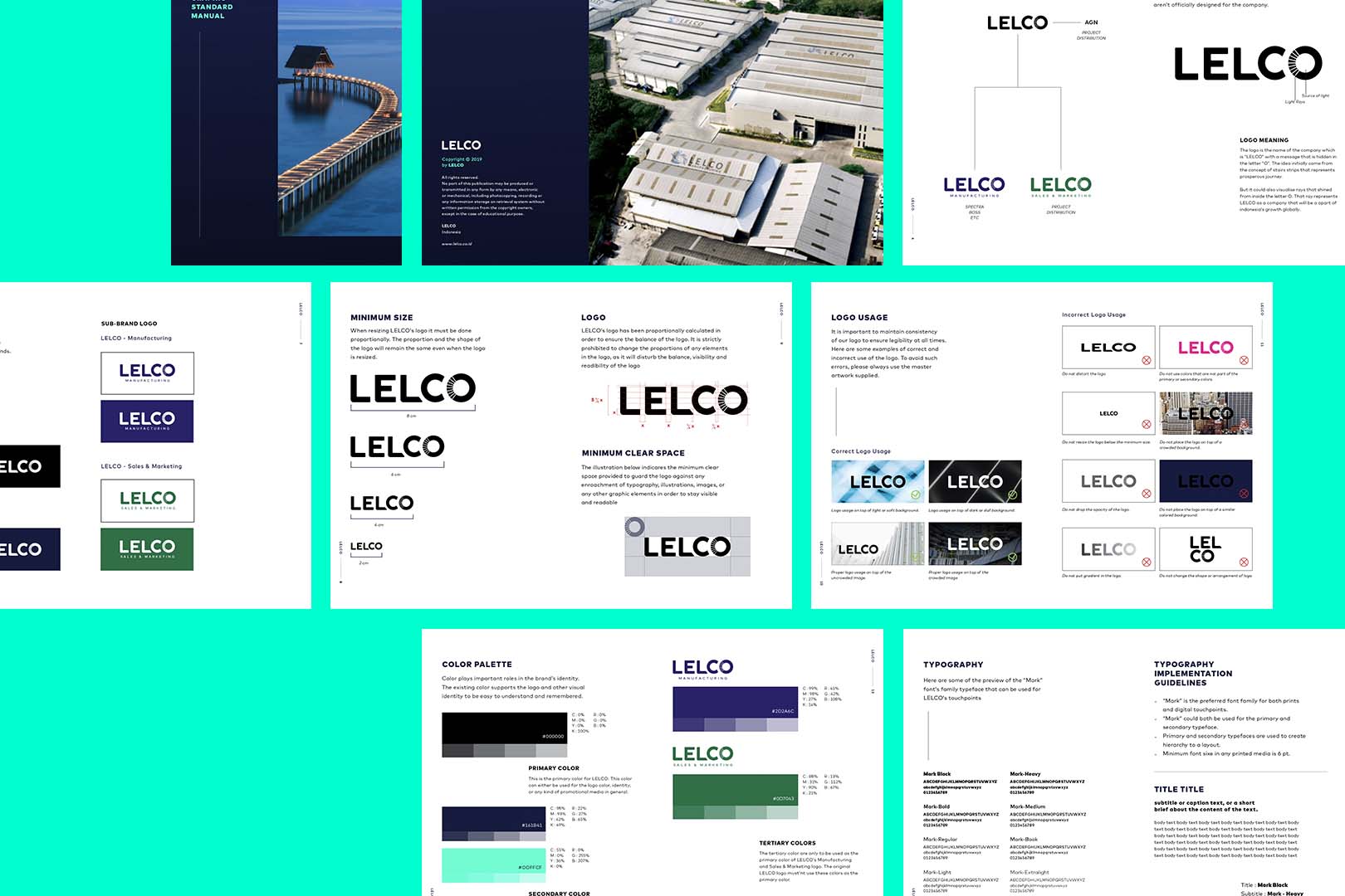
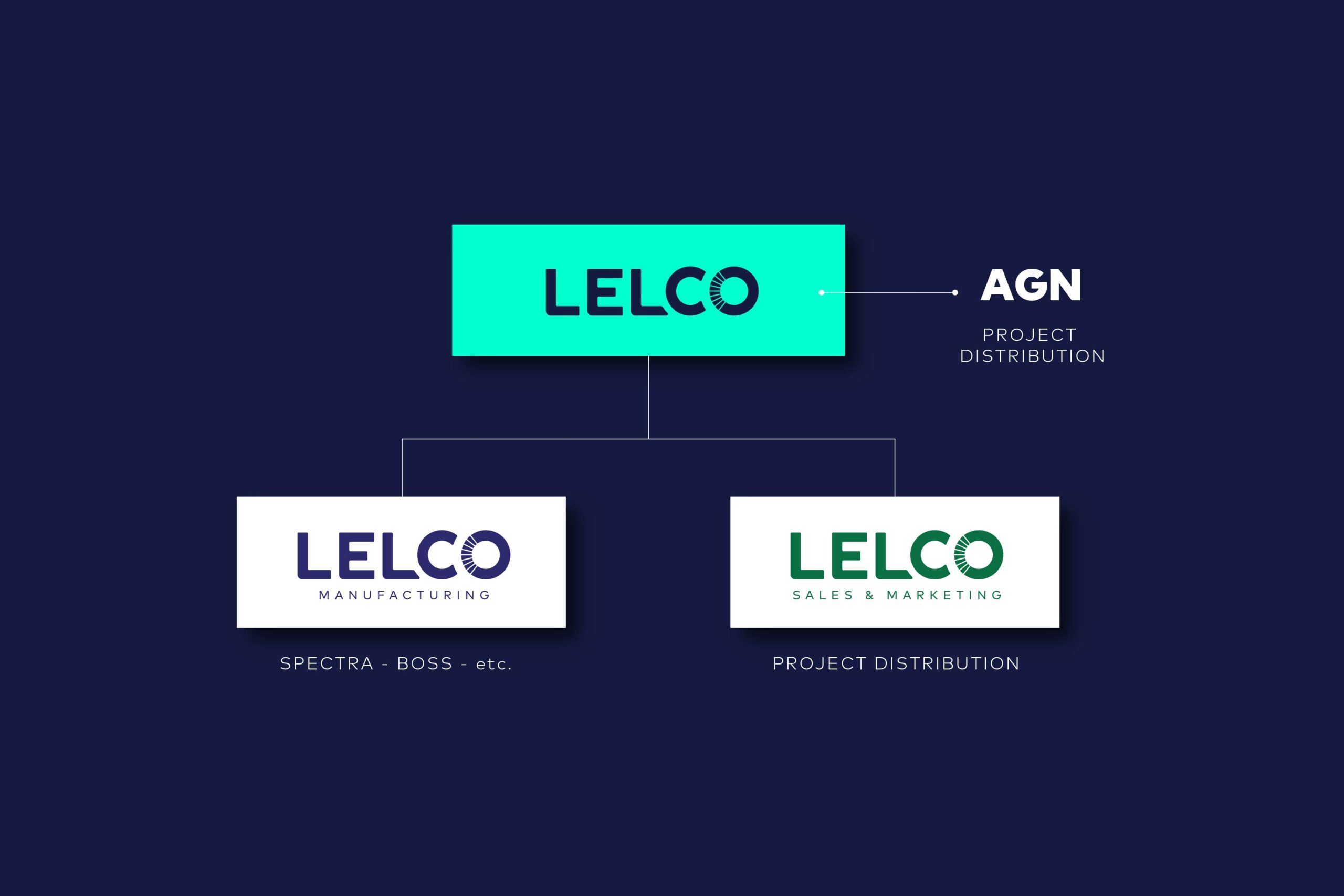
We started by reimagining the logo, turning the final “O” in LELCO into a symbol of growth and light. The design represents both stair-like progress and radiating energy—a subtle nod to the brand’s commitment to innovation and expansion.
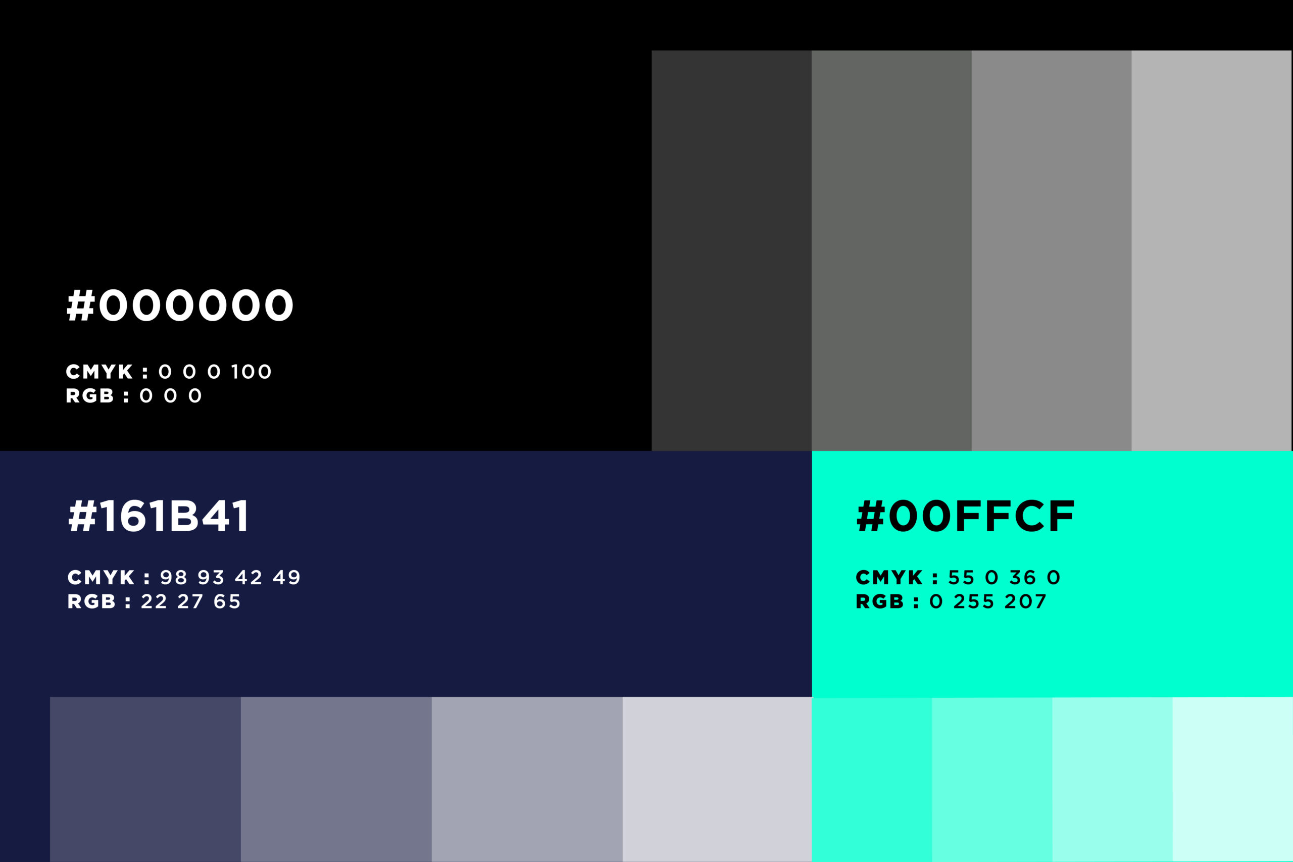
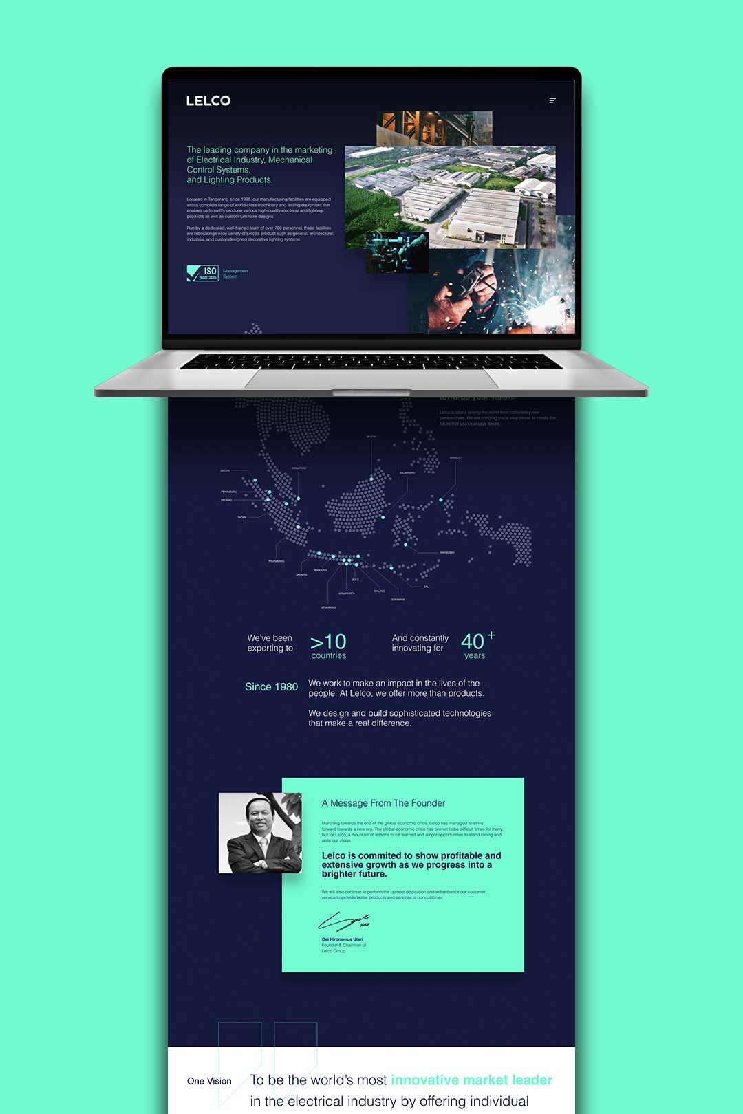
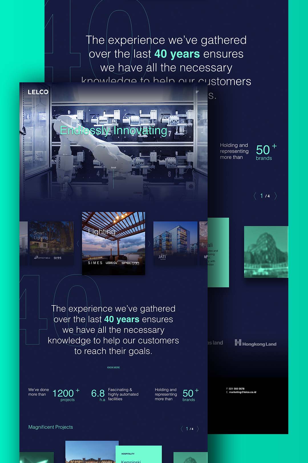
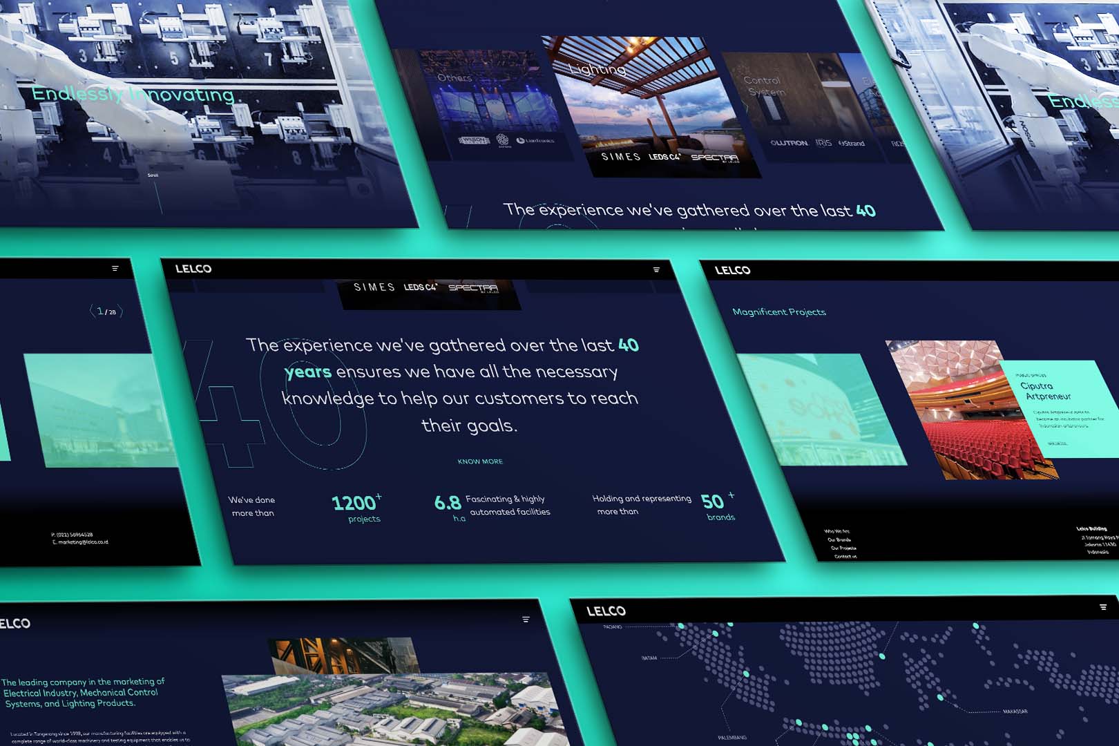
The brand visuals were reworked to feel sharp, modern, and confident—anchored by dark blues and accented with bold neon tones, inspired by the very thing LELCO is known for: light shining through the dark.
EXECUTION
A Visual Identity That Glows
- 💡 A symbolic logotype featuring the radiating “O” to reflect progress and innovation
- 🌐 A revamped brand look and feel with clean, minimalist layouts and bold color contrast
- ✍️ A refined tagline and tone that communicates clarity, ambition, and industry leadership
- 🧭 Design cues inspired by LELCO’s mission to bring brightness and individuality to every space
The new design positions LELCO as a forward-thinking player in both local and global markets—ready to light the future with confidence.
RESULTS
Where Legacy Meets Innovation
With a powerful new identity in place, LELCO is no longer just a manufacturer—it’s a brand that represents energy, growth, and transformation. Its visual evolution mirrors the company’s own journey: grounded in experience, driven by innovation, and always looking ahead.
Because when you’ve been brightening lives for over 40 years, the next step should feel even more electric.